Maelstrom Gaming is a team competing in League of Legends. But that’s not what this is about. This is about their homepage and parallax scrolling.
I stumbled upon their homepage and realized they had extreme performance issues when scrolling. After a quick look in DevTools showed that it was fixable, I decided to write about the process as it would make a really nice show-case on how to detect, analyze and solve performance issues. The site is a single page without much content and no extraordinary features (except for maybe parallax scrolling), so I was pretty sure I could fit it in a regular-sized article.
Always profile
The golden rule of optimization is: Always profile. Don’t guess where your bottlenecks are but gather hard numbers first. Although the jank during scrolling is strong enough to be visible to the naked eye and make you angry, the reason for it is not. It could be blocking JavaScript or expensive CSS operations. DevTools’ timeline can help you figure this out.
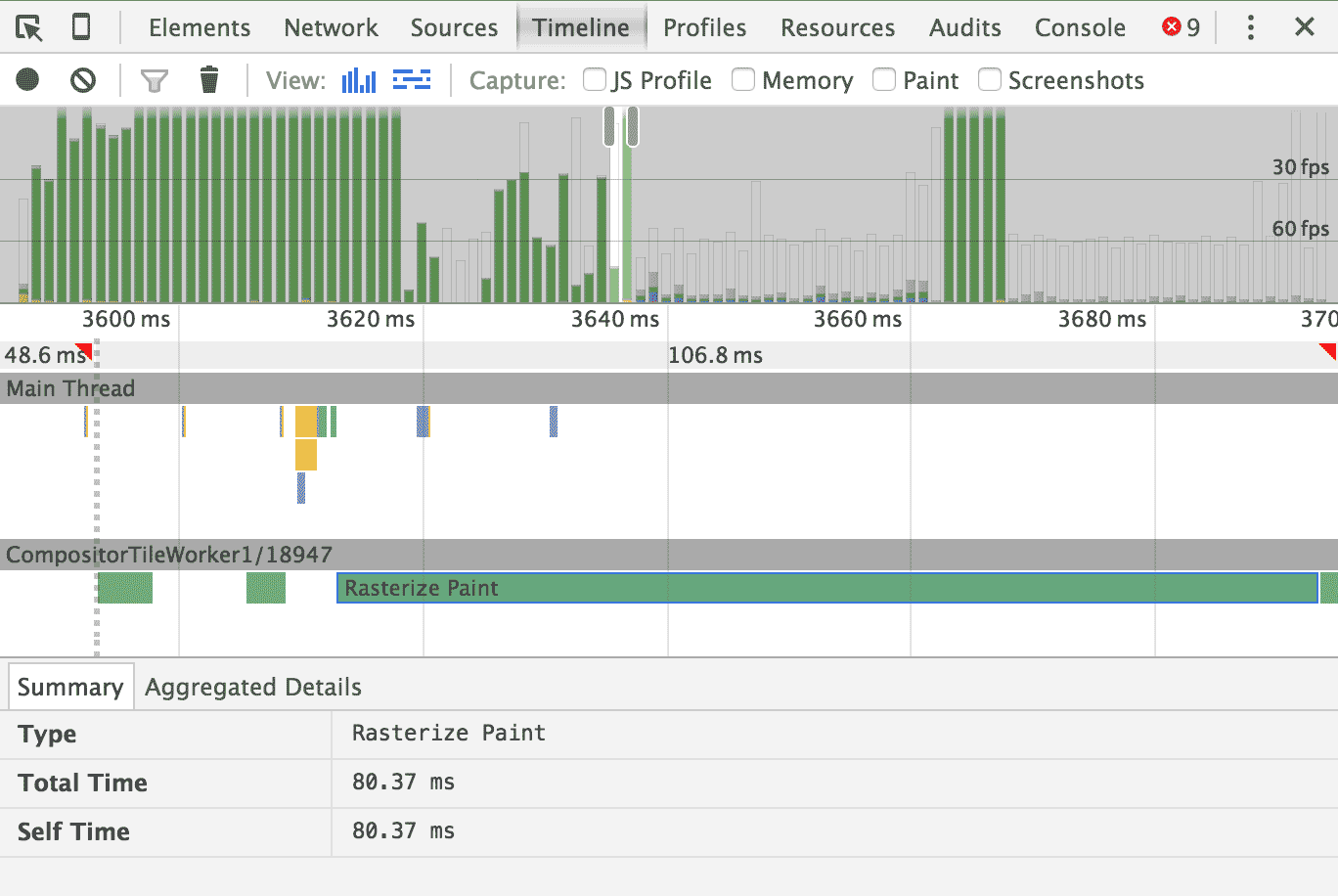
The bars at the top show that we are way below 60fps, even below 30fps. The bars are green, which means “rasterized” and “paint” are responsible. Yes, “rasterize” and “paint” are two operations. A single bar shows a duration of 80ms, which would mean we are rendering with 12fps. That’s not good.
Parallax scrolling is notorious for impacting scrolling performance negatively when not implemented right. And most implementations are not right. That’s why my colleague Paul Lewis, well-known performance connoisseur, wrote a dedicated piece on parallax scrolling.
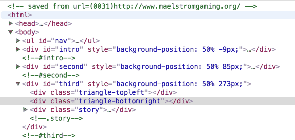
The DOM inspector shows element styles being set by JavaScript (i.e. they flash
pink when scrolling), suggesting that
background-position is being used to move the background images – a strong
indicator for a “not right” implementation of parallax scrolling. A quick look
at CSS triggers (another helpful website by, you guessed it, Paul Lewis)
reveals that changing background-position will always
trigger a repaint – an expensive operation, that is also entirely unnecessary
considering that the individual visuals haven’t changed, they just changed
position. Since these repaints are triggered on every frame when scrolling, the
frame rate plummets.
<script type="text/javascript" src="./Team Imagine_files/jquery.min.js"></script>
<script type="text/javascript" src="./Team Imagine_files/jquery.parallax-1.1.3.js"></script>
<script type="text/javascript" src="./Team Imagine_files/jquery.localscroll-1.2.7-min.js"></script>
<script type="text/javascript" src="./Team Imagine_files/jquery.scrollTo-1.4.2-min.js"></script>
<script type="text/javascript" src="./Team Imagine_files/jquery.inview.js"></script>
<script type="text/javascript">
  $(document).ready(function () {
    $('#nav').localScroll(800);
    $('#first-page').localScroll(800);
    $('#intro').parallax("50%", 0.1);
    $('#second').parallax("50%", 0.1);
    $('.bg').parallax("50%", 0.4);
    $('#third').parallax("50%", 0.3);
  })
</script>
Looking at the code, I found that the site was using a jQuery plugin to do it’s
parallaxin’. I removed that plugin and its invocation, and indeed, the background
images weren’t moving anymore but scrolling performance didn’t increase, either.
Looking around further, I found background-attachment: fixed set on all the
containers with a background image. That property is another way to trigger a
repaint on every frame while scrolling, so I just removed the background images
altogether because I got impatient.

Looking at the timeline afterwards, I was pretty sure I found the culprit as we were easily hitting 60fps. So let’s get our hands dirty trying to fix this.
Compositing layers
I won’t reiterate everything Paul explained in his article, as he did it better than I ever could, so I will rather document what I did. But the TL;DR is:
We want to move the background images to their own compositing layer to utilize the GPU and move them around with CSS transforms to avoid repaints.
I added a new element for the background image to each of the sections
of the website. This
element will be moved to its own compositing layer and will only have a
background image. The parallax effect will be achieved by applying a
translateY() transform after scrolling. The element will get position: absolute
and get a z-index so it can be “under” the content of the section. Like a
real, grown-up background image.
<div id="second">
  <div class="background"></div>
  <!-- ... -->
</div>
There’s two more parallax-ly scrolling images and they got the same treatment, but for brevity’s sake I won’t show their in the code excerpts as it is exactly the same. Take a look at the repository for the full code (in nice, bite-sized commits).
#second {
  position: relative;
  /* ... */
}
#second .background {
  background-image: url(img/background3.png);
}
#second > *:not(.background) {
  position: relative;
  z-index: 5;
}
.background {
  position: absolute;
  will-change: transform;
  top: 0;
  left: 0;
  width: 100%;
  height: 100%;
  z-index: 1;
  background-position: 50% 0;
  background-repeat: no-repeat;
}
I am not necessarily proud of the *:not(.background) selector, but it was the
easiest way to ensure that all other content had a higher z-index than the
background element.
will-change: transform is a CSS trick to force an element onto its own
compositing layer. Sadly, though, it’s one of those things that doesn’t work
in every browser. For example, to accommodate Safari, you will need to use a 3D
transform like transform: translate3d(0, y, 0) to achieve the desired effect.
The images are now neither fixed nor is there a parallax effect, but we are at 60fps with images, which is… progress. Let’s re-implement the parallax effect.
Actually parallaxin’
We can’t use the original jQuery plugin as it relies on background-position
and is therefore bad. Parallax isn’t too complicated so let’s just write our
own piece of JavaScript.
var parallax = {
  '#second': {
    factor: 0.1
  },
  '#third': {
    factor: 0.1
  },
  '#fifth': {
    factor: 0
  }
};

var windowHeight = window.innerHeight;
var scrollY = window.scrollY;
var rAFScheduled = false;
parallax is just the configuration object which defines the parallax scrolling speed.
A factor of 0 would attach the image to the background, exactly like
background-attachment: fixed. A factor of 1 means normal behavior, as in the
background image is attached to the element.
// Gather offset data
Object.keys(parallax).forEach(function(id) {
  parallax[id].element = document.querySelector(id).querySelector('.background');
  parallax[id].initialTop = parallax[id].element.getBoundingClientRect().top + window.scrollY;
});
Here we are fetching the actual background element as well as its distance to the top of the page. We need this data for the parallax effect, but we only need to calculate it once. This is about performance, after all, remember?
Let’s get to the handlers for the scroll and resize event. Both of them just
update the values of our intermediate variables defined earlier.
The intermediate variables let us avoid accessing
the window object, which can trigger a “sync layout”, another expensive operation.
Additionally, scroll issues a requestAnimationFrame, where the translation
of the background images will be calculated and applied. This debounces the
calculation of the new image positions, as it only needs to happen once per frame.
window.addEventListener('scroll', function() {
  scrollY = window.scrollY;
  if(!rAFScheduled) {
    rADScheduled = true;
    requestAnimationFrame(updateParallaxImages);
  }
});

window.addEventListener('resize', function() {
  windowHeight = window.innerHeight;
});
There’s some arithmetic going on in updateParallaxImages, but to make it more
intuitive think about
parallax scrolling this way: Parallax scrolling are images behaving like
background-attachment: fixed, but additionally move by a small fraction of
the distance you actually scrolled.
function updateParallaxImages() {
  Object.keys(parallax).forEach(function(id) {
    // This offset alone would emulate fixed positioning
    var offset = -parallax[id].initialTop + scrollY;

    // If the top border of the container is on the bottom
    // border of the screen: scroll = 0
    // Of the bottom border of the container is on the top
    // border of the screen: scroll = 1
    var scroll = (scrollY - parallax[id].initialTop + windowHeight)/(2*windowHeight);
    offset -= (1-scroll)*windowHeight*parallax[id].factor;
    parallax[id].element.style.transform = 'translateY(' + Math.round(offset) + 'px)';
  });
}
And with that, we have implemented our own parallax scrolling effect that works at a buttery-smooth 60fps.

I am done. No really, tho, I’m not done…
This is where I wanted to stop, but it turns out that the site is doing some other stuff wrong as well that is related to the parallax scrolling: The images themselves. Coincidentally, I looked the total page size in the network inspector.
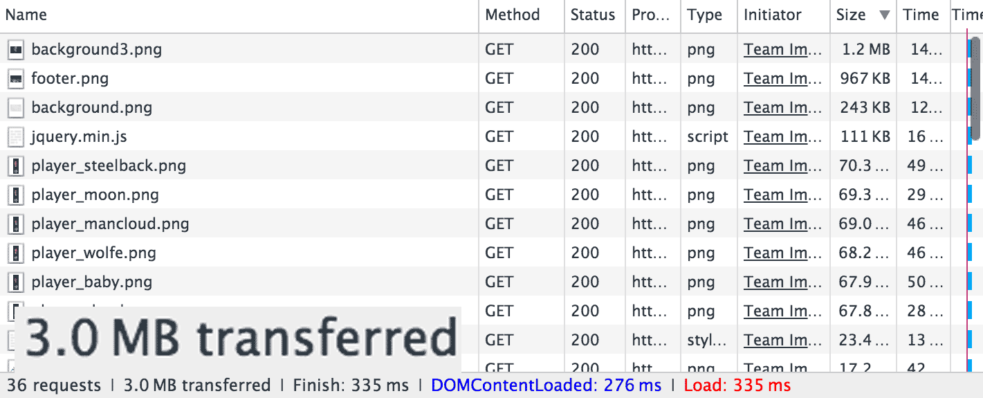
3MB is way too much for a simplistic website like this. The individual resources, ordered by size, reveal that it’s the background images that have a massive size.
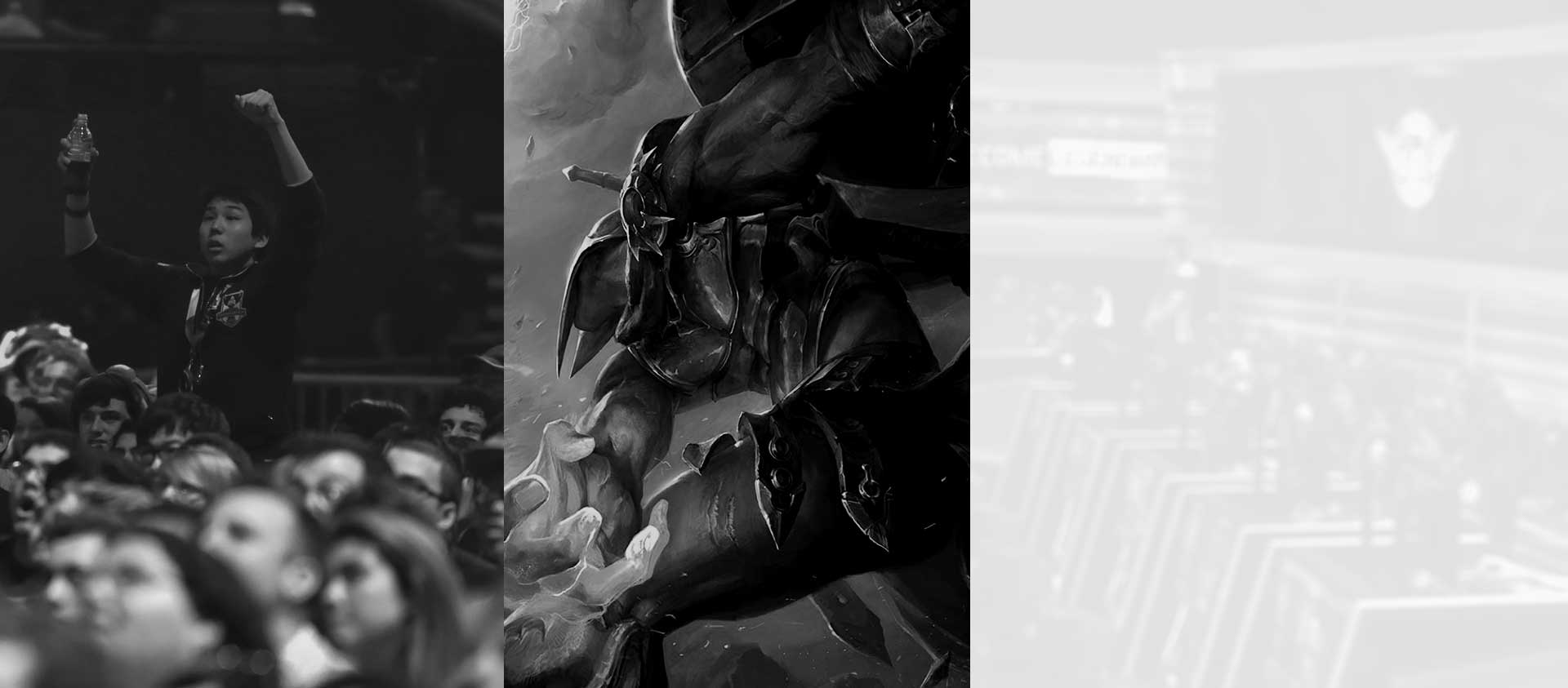
The images are 1920px in width, but that is not the mistake here and is actually required to have a decent visual on retina displays. Rather, it’s the image format. PNGs excel at large areas of the same color, that’s why digital drawings are usually saved as PNG. These however are photographs with gradients, noise and no sharp edges. So PNG’s compression won’t do much. Lossy compressions achieve drastically smaller file sizes while maintaining perceived quality.
Simply by converting the background images and the player images further down
on the page to JPEG with ImageMagick’s convert, I cut the total size from 3MB
to 650KB, without any visual impact. By piping our new JPGs through ImageOptim,
I saved another 21KB.
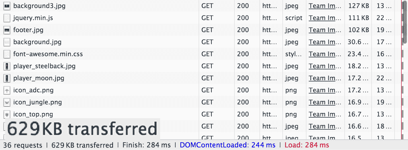
That’s a lot better. It’s still pretty big for a page like this, but a reduction to 20% of it’s original size is a good start.
What’s left?
Now I will actually stop tinkering, but there’s a lot more that could be done better on this page:
- Make the background images responsive by saving them in multiple resolutions and load the appropriate version using media queries.
- Remove jQuery and it’s plugins, currently weighing in at roughly 128KB and only a tiny fraction of the code being used.
- Don’t include the entire Font Awesome font for the very small number of icons on this website. I’d prefer individual SVGs in this case.
- Minify HTML, JS and CSS (saves 11KB).
- Enable GZIP/Deflate compression (saves another 150KB!!).
There’s additional things that could be improved not related to page size:
- Load scripts with
deferto speed up time to first render. - Inline a minimal set of critical CSS needed for a speedy first render and load the rest of the styles asynchronously afterwards.
- Think about your users on mobile devices.
All the individual steps I took (and a few additional ones I didn’t even write about) can be found in my surma-dump/maelstromgaming repository on GitHub.