The answer is will-change: transform. Or is it?
TL;DR: Unless you will change
transform, don’t usewill-change: transform. Usewill-change: opacityorbackface-visibility: hidden, as their side-effects are less disturbing on average.
A primer to layers
A very simplified rendering engine of a browser works as follows:
- Download and parse HTML, generating a DOM tree.
- Process styling to lay out the document, generating a “layout tree”.
- Turn the layout tree into paint instructions, generating a “paint tree”.
- Generate a canvas big enough to hold the entire document.
- Execute all those paint instruction on that canvas.
This work brilliantly until you make changes often. Like 60 times a second often. If, for example, we want to have an element rotating, we can’t really reuse the old canvas. We have to start fresh and go all the way back to step 2.
Wouldn’t it be nicer if we painted the rotating element on a transparent piece of film? This way we could keep the document’s canvas around and reuse it, only throwing away that tiny piece of film. That’s what “layers” do.
Whenever you use CSS Animations or CSS Transitions, the browser will automatically put the animated elements on a layer for you. It keeps the main canvas around for the next frame and keeps the additional work as low as possible.
You can make layers visible in DevTools in two ways:
- You can enable “Layer Borders” in DevTool’s “Rendering” tab so you can see orange borders around elements that are on a separate layer.
- You can check out the “Layers” tab in DevTools to get a real-time and interactive view of all layers on the current page.
History
Okay, here’s the thing: I wish you wouldn’t have to worry whether an element is on its own layer or not. That’s an implementation detail. Ideally, the browser would know what’s appropriate and just do it. Sadly, that’s not the reality. You, the developer, know your code and all the possible branches, so only you are in a position to tell what kind of optimization makes sense. For example: When you animate an element on a frame-by-frame basis using requestAnimationFrame(). It’s hard — nay, impossible for the browser to tell that the element will have a new value for transform each frame. Unless you put the animated element on its own layer yourself, you will run into performance issues because the browser will re-paint the entire document every frame.
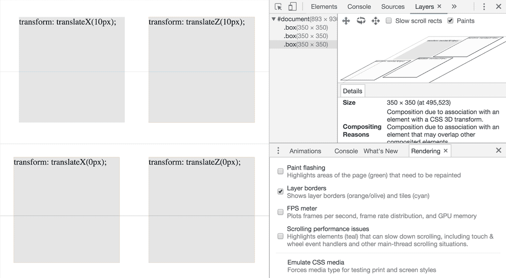
Back in ye olden days the trick of choice was to set transform: translateZ(0). It has to be translateZ, as it will use the GPU to calculate the perspective distortion (even if it ends up being no distortion at all). If you use translateX or translateY, no perspective distortion is necessary and the browser will paint the element into the main canvas, just with the specified offsets (demo).
Because this used to make elements flicker in Chrome and Safari (that is not the case anymore), so people were advised to set backface-visibility: hidden on their elements instead — and this advice is still being propagated to this day.
Fast forward to March 2016: iOS 9 gets support for the will-change property that tells a browser that a certain CSS property… well, will change. If you set will-change: transform on an element, you are telling the browser that the transform property will change in the near future. As a result the browser can speculatively apply optimizations to accommodate for these future changes. In the case of transform that means it will force the element onto its own layer. Even though Edge does not support will-change, it has become best practice to use will-change: transform to force a an element onto a layer. Edge’s architecture is quite different from Chrome, Firefox and Safari and manages to do these kind of animations performantly without needing the will-change hint.
Side-effects
What might not be immediately obvious is that all of these techniques have side-effect with varying degrees of eugh.
backface-visibility
As the name implies, backface-visibility: hidden has the side-effect to hide the back-side of your element. Usually that side is not “facing” the user, but when you rotate your elements in 3D space, it can happen. If you take a look at this demo and press the “Flip boxes” button, you can see that the element with backface-visibility: hidden has it’s backface hidden.
will-change: transform
will-change: transform tells the browser that this element’s transform will change in the near future. Because of these semantics, the spec prescribes that setting will-change: <something> must have the same side-effects as any non-initial value for that <something> property.
This seems plausible, but can trip you up when using position: fixed or position: absolute. Take a look in this demo:
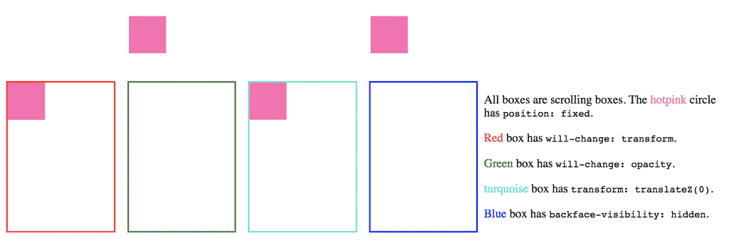
If you set a value for transform, you create what is called a new “containing block”. Any child elements with position: fixed or position: absolute are now relative to this new containing block, hence the inconsistent positioning of the pink box in the demo. This is one of those subtle side-effects that, while they are in the spec, are not really what I’d call intuitive. I still stumble over this from time to time.
transform: translateZ(0)
transform: translateZ(0) has the same side-effects as will-change: transform (it does set a transform after all), but also might interfere with your other styles that use transform, as these properties overwrite each other according to the cascade. If you take a look at both of the earlier demos, you can see the elements that (ab)use transform: translateZ(0) are misbehaving.
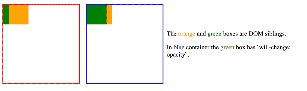
will-change: opacity
In case you hadn’t noticed, the element using will-change: opacity behaved as expected in the previous demo. That doesn’t mean it’s side-effect free, though. Setting will-change: opacity creates a new “stacking context”. That’s yet another CSS specification term and — in short — means that it can affect the order in which elements are rendered. If you have overlapping elements, it can change which element is “on top”, as this demo shows. But even when that happens, z-index is there to help you restore the order that you want.
I don’t like will-change
I have grown to dislike will-change. I think the indirect nature of the semantics that will-change uses make it seem mystical and magic. What you declare doesn’t actually say what you want to achieve. What developers want to signal to the browser is not “I will change these properties” (and buy into all the side-effects at the same time). I believe they’d rather say something along the lines of “put this on its own layer” or “handle this like a bitmap/texture”. Sadly, there’s no nothing on the horizon for this.
For now, we only have will-change and my advice is: Use will-change: opacity or backface-visibility: hidden to force an element onto its own layer as it seems like the side-effects are the most unlikely to be a problem. Only if you are truly going to change the transform should you be using will-change: transform.