I always loved the visual aesthetic of dithering but never knew how it’s done. So I did some research. This article may contain traces of nostalgia and none of Lena.
How did I get here? (You can skip this)
I am late to the party, but I finally played “Return of the Obra Dinn”, the most recent game by Lucas Pope of “Papers Please” fame. Obra Dinn is a story puzzler that I can only recommend, but what piqued my curiosity as a software engineer is that it is a 3D game (using the Unity game engine) but rendered using only 2 colors with dithering. Apparently, this has been dubbed “Ditherpunk”, and I love that.
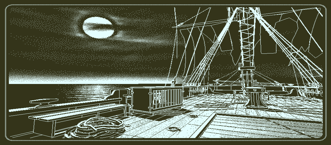
Dithering, so my original understanding, was a technique to place pixels using only a few colors from a palette in a clever way to trick your brain into seeing many colors. Like in the picture, where you probably feel like there are multiple brightness levels when in fact there’s only two: Full brightness and black.
The fact that I have never seen a 3D game with dithering like this probably stems from the fact that color palettes are mostly a thing of the past. You may remember running Windows 95 with 16 colors and playing games like “Monkey Island” on it.
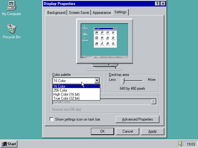
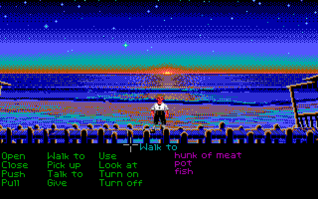
For a long time now, however, we have had 8 bits per channel per pixel, allowing each pixel on your screen to assume one of 16 million colors. With HDR and wide gamut on the horizon, things are moving even further away to ever requiring any form of dithering. And yet Obra Dinn used it anyway and rekindled a long forgotten love for me. Knowing a tiny bit about dithering from my work on Squoosh, I was especially impressed with Obra Dinn’s ability to keep the dithering stable while I moved and rotated the camera through 3D space and I wanted to understand how it all worked.
As it turns out, Lucas Pope wrote a forum post where he explains which dithering techniques he uses and how he applies them to 3D space. He put extensive work into making the dithering stable when camera movements occur. Reading that forum post kicked me down the rabbit hole, which this blog post tries to summarize.
Dithering
What is Dithering?
According to Wikipedia, “Dither is an intentionally applied form of noise used to randomize quantization error”, and is a technique not only limited to images. It is actually a technique used to this day on audio recordings, but that is yet another rabbit hole to fall into another time. Let’s dissect that definition in the context of images. First up: Quantization.
Quantization
Quantization is the process of mapping a large set of values to a smaller, usually finite, set of values. For the remainder of this article, I am going to use two images as examples:
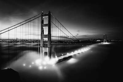
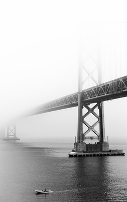
Both black-and-white photos use 256 different shades of gray. If we wanted to use fewer colors — for example just black and white to achieve monochromaticity — we have to change every pixel to be either pure black or pure white. In this scenario, the colors black and white are called our “color palette” and the process of changing pixels that do not use a color from the palette is called “quantization”. Because not all colors from the original images are in the color palette, this will inevitably introduce an error called the “quantization error”. The naïve solution is to quantizer each pixel to the color in the palette that is closest to the pixel’s original color.
Note: Defining which colors are “close to each other” is open to interpretation and depends on how you measure the distance between two colors. I suppose ideally we’d measure distance in a psycho-visual way, but most of the articles I found simply used the euclidean distance in the RGB cube, i.e. .
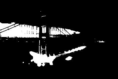
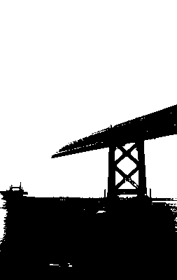
With our palette only consisting of black and white, we can use the brightness of a pixel to decide which color to quantize to. A brightness of 0 means black, a brightness of 1 means white, everything else is in-between, ideally correlating with human perception such that a brightness of 0.5 is a nice mid-gray. To quantize a given color, we only need to check if the color’s brightness is greater or less than 0.5 and quantize to white and black respectively. Applying this quantization to the image above yields an... unsatisfying result.
grayscaleImage.mapSelf(brightness =>
  brightness > 0.5
    ? 1.0
    : 0.0
);
Note: The code samples in this article are real but built on top of a helper class
GrayImageF32N0F8I wrote for the demo of this article. It’s similar to the web’sImageData, but usesFloat32Array, only has one color channel, represents values between 0.0 and 1.0 and has a whole bunch of helper functions. The source code is available in the lab.
Gamma
I had finished writing this article and just wanted to “quickly” look what a black-to-white gradient looks like with the different dithering algorithms. The results showed me that I failed to consider the thing that always becomes a problem when working with images: color spaces. I had written the sentence “ideally correlating with human perception” without actually following it myself.
My demo is implemented using web technologies, most notably <canvas> and ImageData, which are — at the time of writing — specified to use sRGB. It’s an old color space specification (from 1996) whose value-to-color mapping was modeled to mirror the behavior of CRT monitors. While barely anyone uses CRTs these days, it’s still considered the “safe” color space that gets correctly displayed on every display. As such, it is the default on the web platform. However, sRGB is not linear, meaning that in sRGB is not the color a human sees when you mix 50% of and . Instead, it’s the color you get when you pump half the power of full white through your Cathode-Ray Tube (CRT).

Warning: I set
image-rendering: pixelated;on most of the images in this article. This allows you to zoom in and truly see the pixels. However, on devices with fractiondevicePixelRatio, this might introduce artifacts. If in doubt, open the image separate in a new tab.
As this image shows, the dithered gradient gets bright way too quickly. If we want 0.5 be the color in the middle of pure black and white (as perceived by a human), we need to convert from sRGB to linear RGB space, which can be done with a process called “gamma correction”. Wikipedia lists the following formulas to convert between sRGB and linear RGB.
With these conversions in place, dithering produces (more) accurate results:

Random noise
Back to Wikipedia’s definition of dithering: “Intentionally applied form of noise used to randomize quantization error”. We got the quantization down, and now it says to add noise. Intentionally.
Instead of quantizing each pixel directly, we add noise with a value between -0.5 and 0.5 to each pixel. The idea is that some pixels will now be quantized to the “wrong” color, but how often that happens depends on the pixel’s original brightness. Black will always remain black, white will always remain white, a mid-gray will be dithered to black roughly 50% of the time. Statistically, the overall quantization error is reduced and our brains are eager to do the rest and help you see the, uh, big picture.
grayscaleImage.mapSelf(brightness =>
  brightness + (Math.random() - 0.5) > 0.5
    ? 1.0
    : 0.0
);
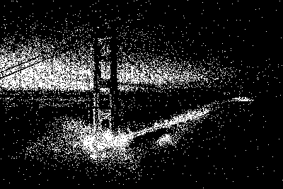
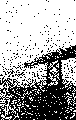
I found this quite surprising! It is by no means good — video games from the 90s have shown us that we can do better — but this is a very low effort and quick way to get more detail into a monochrome image. And if I was to take “dithering” literally, I’d end my article here. But there’s more…
Ordered Dithering
Instead of talking about what kind of noise to add to an image before quantizing it, we can also change our perspective and talk about adjusting the quantization threshold.
// Adding noise
grayscaleImage.mapSelf(brightness =>
  brightness + Math.random() - 0.5 > 0.5
    ? 1.0
    : 0.0
);

// Adjusting the threshold
grayscaleImage.mapSelf(brightness =>
  brightness > Math.random()
    ? 1.0
    : 0.0
);
In the context of monochrome dithering, where the quantization threshold is 0.5, these two approaches are equivalent:
The upside of this approach is that we can talk about a “threshold map”. Threshold maps can be visualized to make it easier to reason about why a resulting image looks the way it does. They can also be precomputed and reused, which makes the dithering process deterministic and parallelizable per pixel. As a result, the dithering can happen on the GPU as a shader. This is what Obra Dinn does! There are a couple of different approaches to generating these threshold maps, but all of them introduce some kind of order to the noise that is added to the image, hence the name “ordered dithering”.
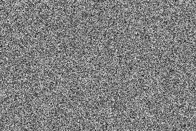
The threshold map for the random dithering above, literally a map full of random thresholds, is also called “white noise”. The name comes from a term in signal processing where every frequency has the same intensity, just like in white light.
Bayer Dithering
“Bayer dithering” uses a Bayer matrix as the threshold map. They are named after Bryce Bayer, inventor of the Bayer filter, which is in use to this day in digital cameras. Each pixel on the sensor can only detect brightness, but by cleverly arranging colored filters in front of the individual pixels, we can reconstruct color images through demosaicing. The pattern for the filters is the same pattern used in Bayer dithering.
Bayer matrices come in various sizes which I ended up calling “levels”. Bayer Level 0 is matrix. Bayer Level 1 is a matrix. Bayer Level is a matrix. A level matrix can be recursively calculated from level (although Wikipedia also lists an per-cell algorithm). If your image happens to be bigger than your bayer matrix, you can tile the threshold map.
A level Bayer matrix contains the numbers to . Once you normalize the Bayer matrix, i.e. divide by , you can use it as a threshold map:
const bayer = generateBayerLevel(level);
grayscaleImage.mapSelf((brightness, { x, y }) =>
  brightness > bayer.valueAt(x, y, { wrap: true })
    ? 1.0
    : 0.0
);
One thing to note: Bayer dithering using matrices as defined above will render an image lighter than it originally was. For example: An area where every pixel has a brightness of , a level 0 Bayer matrix of size will make one out of the four pixels white, resulting in an average brightness of . This error gets smaller with higher Bayer levels, but a fundamental bias remains.
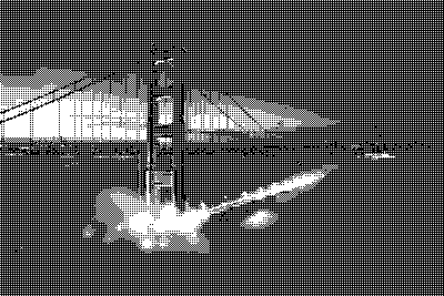
In our dark test image, the sky is not pure black and made significantly brighter when using Bayer Level 0. While it gets better with higher levels, an alternative solution is to flip the bias and make images render darker by inverting the way we use the Bayer matrix:
const bayer = generateBayerLevel(level);
grayscaleImage.mapSelf((brightness, { x, y }) =>
  //           👇
  brightness > 1 - bayer.valueAt(x, y, { wrap: true })
    ? 1.0
    : 0.0
);
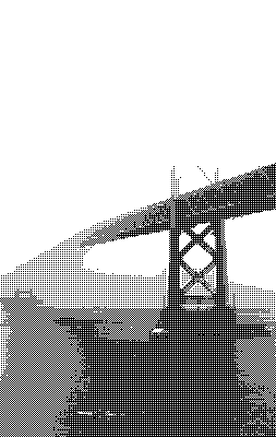
I have used the original Bayer definition for the light image and the inverted version for the dark image. I personally found Level 1 and 3 the most aesthetically pleasing.

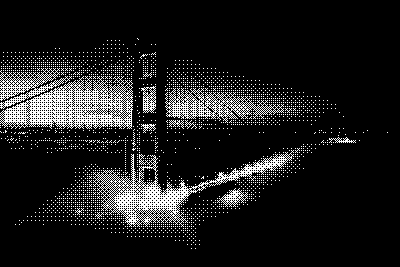


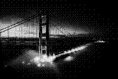

Blue noise
Both white noise and Bayer dithering have drawbacks, of course. Bayer dithering, for example, is very structured and will look quite repetitive, especially at lower levels. White noise is random, meaning that there inevitably will be clusters of bright pixels and voids of darker pixels in the threshold map. This can be made more obvious by squinting or, if that is too much work for you, through blurring the threshold map algorithmically. These clusters and voids can affect the output of the dithering process negatively. If darker areas of the image fall into one of the clusters, details will get lost in the dithered output (and vice-versa for brighter areas falling into voids).
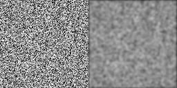
There is a variant of noise called “blue noise”, that addresses this issue. It is called blue noise because higher frequencies have higher intensities compared to the lower frequencies, just like blue light. By removing or dampening the lower frequencies, cluster and voids become less pronounced. Blue noise dithering is just as fast to apply to an image as white noise dithering — it’s just a threshold map in the end — but generating blue noise is a bit harder and expensive.
The most common algorithm to generate blue noise seems to be the “void-and-cluster method” by Robert Ulichney. Here is the original whitepaper. I found the way the algorithm is described quite unintuitive and, now that I have implemented it, I am convinced it is explained in an unnecessarily abstract fashion. But it is quite clever!
The algorithm is based on the idea that you can find a pixel that is part of cluster or a void by applying a Gaussian Blur to the image and finding the brightest (or darkest) pixel in the blurred image respectively. After initializing a black image with a couple of randomly placed white pixels, the algorithm proceeds to continuously swap cluster pixels and void pixels to spread the white pixels out as evenly as possible. Afterwards, every pixel gets a number between 0 and n (where n is the total number of pixels) according to their importance for forming clusters and voids. For more details, see the paper.
My implementation works fine but is not very fast, as I didn’t spend much time optimizing. It takes about 1 minute to generate a 64×64 blue noise texture on my 2018 MacBook, which is sufficient for these purposes. If something faster is needed, a promising optimization would be to apply the Gaussian Blur not in the spatial domain but in the frequency domain instead.
Excursion: Of course knowing this nerd-sniped me into implementing it. The reason this optimization is so promising is because convolution (which is the underlying operation of a Gaussian blur) has to loop over each field of the Gaussian kernel for each pixel in the image. However, if you convert both the image as well as the Gaussian kernel to the frequency domain (using one of the many Fast Fourier Transform algorithms), convolution becomes an element-wise multiplication. Since my targeted blue noise size is a power of two, I could implement the well-explored in-place variant of the Cooley-Tukey FFT algorithm. After some initial hickups, it did end up cutting the blue noise generation time by 50%. I still wrote pretty garbage-y code, so there’s a lot more to room for optimizations.
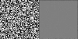
As blue noise is based on a Gaussian Blur, which is calculated on a torus (a fancy way of saying that Gaussian blur wraps around at the edges), blue noise will also tile seamlessly. So we can use the 64×64 blue noise and repeat it to cover the entire image. Blue noise dithering has a nice, even distribution without showing any obvious patterns, balancing rendering of details and organic look.


Error diffusion
All the previous techniques rely on the fact that quantization errors will statistically even out because the thresholds in the threshold maps are uniformly distributed. A different approach to quantization is the concept of error diffusion, which is most likely what you have read about if you have ever researched image dithering before. In this approach we don’t just quantize and hope that on average the quantization error remains negligible. Instead, we measure the quantization error and diffuse the error onto neighboring pixels, influencing how they will get quantized. We are effectively changing the image we want to dither as we go along. This makes the process inherently sequential.
Foreshadowing: One big advantage of error diffusion algorithms that we won’t touch on in this post is that they can handle arbitrary color palettes, while ordered dithering requires your color palette to be evenly spaced. More on that another time.
Almost all error diffusion ditherings that I am going to look at use a “diffusion matrix”, which defines how the quantization error from the current pixel gets distributed across the neighboring pixels. For these matrices it is often assumed that the image’s pixels are traversed top-to-bottom, left-to-right — the same way us westerners read text. This is important as the error can only be diffused to pixels that haven’t been quantized yet. If you find yourself traversing an image in a different order than the diffusion matrix assumes, flip the matrix accordingly.
“Simple” 2D error diffusion
The naïve approach to error diffusion shares the quantization error between the pixel below the current one and the one to the right, which can be described with the following matrix:
The diffusion algorithm visits each pixel in the image (in the right order!), quantizes the current pixel and measures the quantization error. Note that the quantization error is signed, i.e. it can be negative if the quantization made the pixel brighter than the original brightness value. We then add fractions of the quantization error to neighboring pixels as specified by the matrix. Rinse and repeat.
This animation is supposed to visualize the algorithm, but won’t be able to show that the dithered result resembles the original. 4×4 pixels are hardly enough do diffuse and average out quantization errors. But it does show that if a pixel is made brighter during quantization, neighboring pixels will be made darker to make up for it (and vice-versa).


However, the simplicity of the diffusion matrix is prone to generating patterns, like the line-like patterns you can see in the test images above.
Floyd-Steinberg
Floyd-Steinberg is arguably the most well-known error diffusion algorithm, if not even the most well-known dithering algorithm. It uses a more elaborate diffusion matrix to distribute the quantization error to all directly neighboring, unvisited pixels. The numbers are carefully chosen to prevent repeating patterns as much as possible.
Floyd-Steinberg is a big improvement as it prevents a lot of patterns from forming. However, larger areas with little texture can still end up looking a bit unorganic.


Jarvis-Judice-Ninke
Jarvis, Judice and Ninke take an even bigger diffusion matrix, distributing the error to more pixels than just immediately neighboring ones.
Using this diffusion matrix, patterns are even less likely to emerge. While the test images still show some line like patterns, they are much less distracting now.

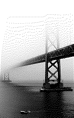
Atkinson Dither
Atkinson dithering was developed at Apple by Bill Atkinson and gained notoriety on on early Macintosh computers.
It’s worth noting that the Atkinson diffusion matrix contains six ones, but is normalized using , meaning it doesn’t diffuse the entire error to neighboring pixels, increasing the perceived contrast of the image.
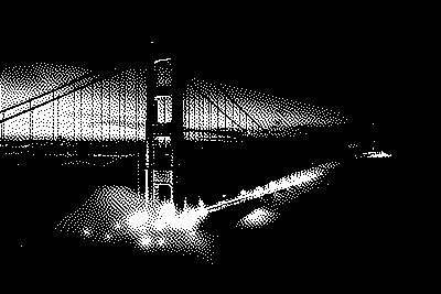

Riemersma Dither
To be completely honest, the Riemersma dither is something I stumbled upon by accident. I found an in-depth article while I was researching the other dithering algorithms. It doesn’t seem to be widely known, but I really like the way it looks and the concept behind it. Instead of traversing the image row-by-row it traverses the image with a Hilbert curve. Technically, any space-filling curve would do, but the Hilbert curve came recommended and is rather easy to implement using generators. Through this it aims to take the best of both ordered dithering and error diffusion dithering: Limiting the number of pixels a single pixel can influence together with the organic look (and small memory footprint).
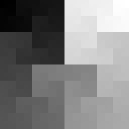
The Hilbert curve has a “locality” property, meaning that the pixels that are close together on the curve are also close together in the picture. This way we don’t need to use an error diffusion matrix but rather a diffusion sequence of length . To quantize the current pixel, the last quantization errors are added to the current pixel with weights given in the diffusion sequence. In the article they use an exponential falloff for the weights — the previous pixel’s quantization error getting a weight of 1, the oldest quantization error in the list a small, chosen weight . This results in the following formula for the th weight:
The article recommends and a minimum list length of , but for my test image I found and to be better looking.

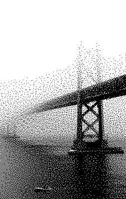
Riemersma dither with and .
The dithering looks extremely organic, almost as good as blue noise dithering. At the same time it is easier to implement than both of the previous ones. It is, however, still an error diffusion dithering algorithm, meaning it is sequential and not suitable to run on a GPU.
💛 Blue noise, Bayer & Riemersma
As a 3D game, Obra Dinn had to use ordered dithering to be able to run it as a shader. It uses both Bayer dithering and blue noise dithering which I also think are the most aesthetically pleasing choices. Bayer dithering shows a bit more structure while blue noise looks very natural and organic. I am also particularly fond of the Riemersma dither and I want to explore how it holds up when there are multiple colors in the palette.
Obra Dinn uses blue noise dithering for most of the environment. People and other objects of interest are dithered using Bayer, which forms a nice visual contrast and makes them stand out without breaking the games overall aesthetic. Again, more on his reasoning as well his solution to handling camera movement in his forum post.
If you want to try different dithering algorithms on one of your own images, take a look at my demo that I wrote to generate all the images in this blog post. Keep in mind that these are not the fastest. If you decide to throw your 20 megapixel camera JPEG at this, it will take a while.
Note: It seems I am hitting a de-opt in Safari. My blue noise generator takes ~30 second in Chrome, but takes >20 minutes Safari. It is considerably quicker in Safari Tech Preview.
I am sure this super niche, but I enjoyed this rabbit hole. If you have any opinions or experiences with dithering, I’d love to hear them.
Thanks & other sources
Thanks to Lucas Pope for his games and the visual inspiration.
Thanks to Christoph Peters for his excellent article on blue noise generation.