I wrote a thing, made everything keyboard controllable and yet Rob Dodson said its accessibility sucked. WHY?!!
The original implementation
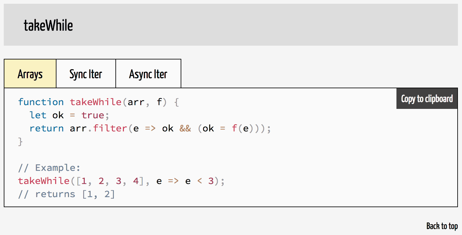
A short while ago I wrote and published Underdash. It’s a collection of snippets for collection manipulation (á la lodash or underscore), but written for copy-pasting and using the newer JavaScript features. Each function has up to 3 implementations. One for arrays, one for synchronous iterators and one for asynchronous iterators (which no JavaScript engine has yet, lol). You can switch between this implementations using tabs.

I thought I’d be smart by using the good old “invisible checkbox + label + CSS adjacent selector styling” trick to implement the tab panel. #usetheplatform and stuff. It would be keyboard controllable and because of the label screen readers would know what to do, too, right?
<style>
  .snippet input {
    display: none;
  }
  .snippet pre {
    display: none;
  }
  .snippet label {
    background-color: hsla(0, 0%, 100%, .54);
  }
  .snippet input.arraycode:checked ~ .snippet label.arraycode,
  .snippet input.itercode:checked ~ .snippet label.itercode,
  .snippet input.aitercode:checked ~ .snippet label.aitercode {
    background-color: hsla(50, 100%, 80%, .54);
  }
  .snippet input.arraycode:checked ~ .snippet pre.arraycode,
  .snippet input.itercode:checked ~ .snippet pre.itercode,
  .snippet input.aitercode:checked ~ .snippet pre.aitercode {
    display: block;
  }
</style>
<section class="snippet">
  <input type="radio" name="takeWhile"
    id="takeWhile_arraycode" class="arraycode" checked>
  <input type="radio" name="takeWhile"
    id="takeWhile_itercode" class="itercode">
  <input type="radio" name="takeWhile"
    id="takeWhile_aitercode" class="aitercode">

  <label for="takeWhile_arraycode" class="arraycode" tabindex="0">
    Arrays
  </label>
  <label for="takeWhile_itercode" class="itercode" tabindex="0">
    Sync Iter
  </label>
  <label for="takeWhile_aitercode" class="aitercode" tabindex="0">
    Async Iter
  </label>

  <pre class="arraycode">
    ... code ...
  </pre>
  <pre class="itercode">
    ... code ...
  </pre>
  <pre class="aitercode">
    ... code ...
  </pre>
</section>
Even though the <input> is hidden, it can still be checked by clicking on the corresponding <label>. Using the CSS’ :checked selector, the visual representation changes accordingly. Here’s a live version of an old snapshot of Underdash. If you want, try out tabbing and switching panels with space. It totally works. But you already know what’s coming (because I said it in the first paragraph). This is not accessible. But why exactly?
Semantics!
While, yes, my implementation was controllable with the keyboard, it had wrong or no semantics. If you throw a screen reader at that snapshot, it will say “Arrays, group”, “Sync Iter, group”, “Async Iter, group” when tabbing through the tabs. As Rob told me, that is the most generic word there is for screen readers. If you make a <div> focusable, the screen reader will call it a “group”. So if someone cannot see the visual representation, there’s no way for them to know that these are in fact tabs. To correct that we’ll have to use ARIA attributes to assign roles to the elements. Additionally, a11y best practices demand that you tab through components, while the individual components consume keys like the arrow keys, home, end etc. to change state. So, let’s fix it!
Rob pointed me to the OpenAjax Alliance’s Accessibility Task Force. They offer a vast number of accessible reference implementations of common UI patterns on the web – also among them: a tab panel. The reference implementation shows how to juggle all the ARIA attributes. However, the code relies on jQuery, uses old JS APIs (or doesn’t use the new ones for that matter) and imposes quite a bit of markup and styling. So I grabbed their code, ported it line by line and then condensed it down to what I needed. In the end, I had under 100 lines of JavaScript code achieving the same functionality as the implementation by OAA. Take a look, if you dare.
A11y? Check! But now we have another problem. We are relying on JavaScript.
Progressive Enhancement? Graceful degradation?
I feel like developers try very hard to do as much as possible without JavaScript. JavaScript is part of the platform. #usetheplatform. The accessibility community specifically seems to have accepted that – provided you can’t use native web elements – you might need JavaScript to add and maintain the semantics of your element. I do, however, also agree with notion of the progressive enhancement crowd that just because JavaScript is disabled your content shouldn’t get disabled, too. So where to draw the line?
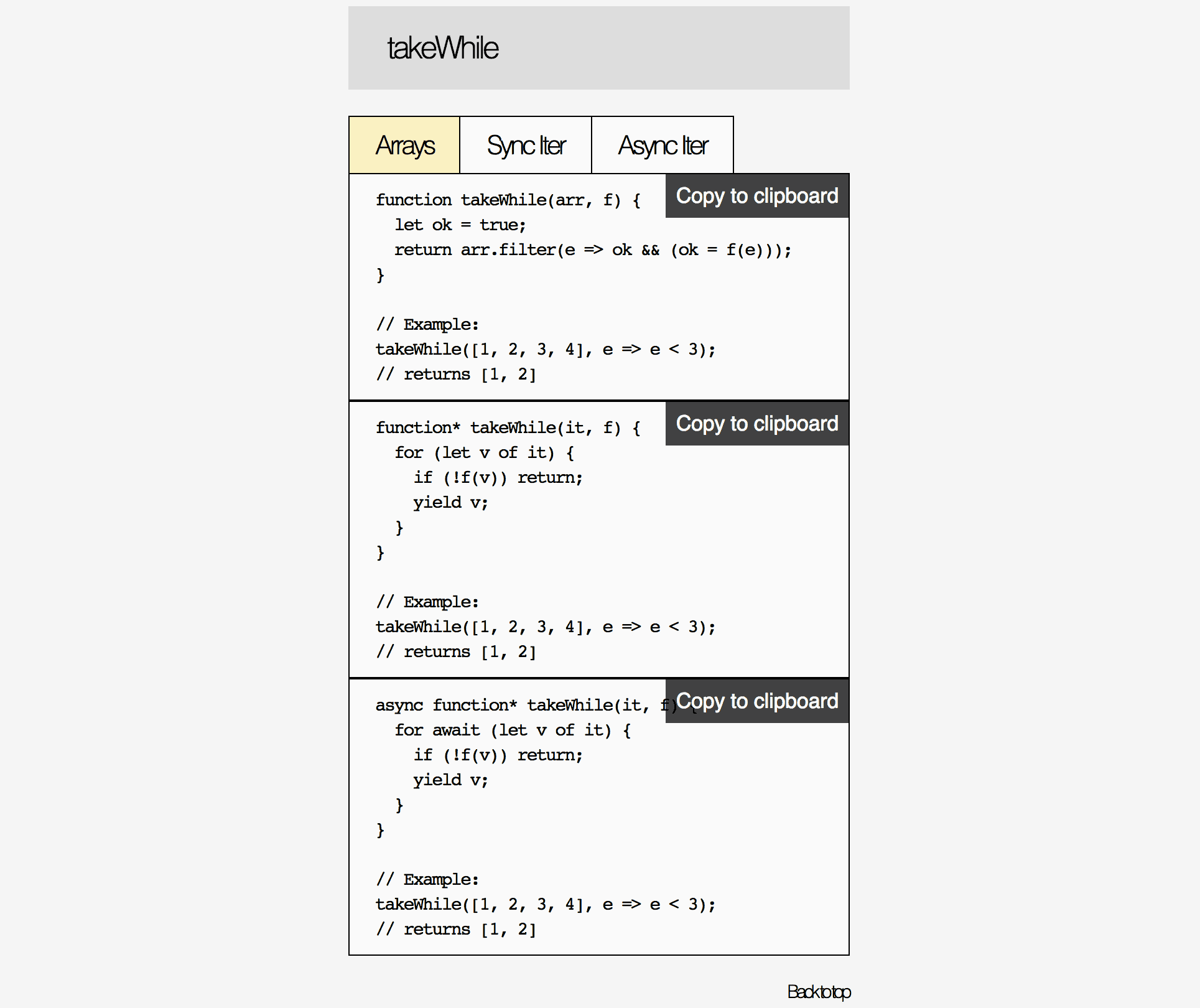
My implementation of the tab panel adds the hidden class in the init() method on elements that are not supposed to be visible. That means if JavaScript is not running, all 3 implementations are visible.

This is pretty good. Could I be doing better? Sure. For example: I could only show the “Copy to Clipboard” button when JavaScript is running. I could load my web fonts using a <noscript> tag instead of JavaScript so that letter spacing and font sizes look better. But, I felt this is “good enough”. People who need JavaScript (for their assistive devices or other things), will have JavaScript enabled and reload the page if it didn’t run for some reason.
It’s a thin line to walk. Where do you progressively enhance? Where do you degrade gracefully? Where is the point of diminishing returns? This was the first conscious exploration of mine on these topics, so don’t treat this as gospel. I am happy to be corrected. Let me know what you think on Twitter.